
Product
Enterprise SaaS
Timeline
2025
Project
Strategic Platform Redesign (Client Retention)
Role
Lead Product Designer
Overview
Unify was an emergency initiative to retain our largest enterprise client, the Department of Transport, a multi-region government organization. The client was reconsidering a $5M contract due to fragmented visibility into community sentiment and its impact on transport project planning. As Lead UX Designer, I was responsible for rapidly designing a decision-support dashboard serving transport planners, project managers, and executives — delivering a fully functional solution in less than 24 hours. As the primary Product Designer, I led a focused intervention to diagnose root causes, realign cross-functional priorities, and deliver high-impact improvements under tight timelines.
The Challenge
Transport planners and executives lacked the visibility required to make informed decisions. Sentiment data existed across social media, surveys, and community submissions, but it was fragmented and difficult to interpret at scale. Planners could not easily track emerging risks, compare regions, or understand the impact of individual projects. This lack of clarity created operational inefficiencies and put a major enterprise contract at risk. The existing tools displayed data but did not support actionable decision-making, leaving stakeholders frustrated and the client’s confidence eroded.
My Role
As Lead UX Designer, I led all aspects of UX and information design. I facilitated workshops with planners and executives to define the critical decision-making workflows, defined KPIs for sentiment and risk tracking, and translated AI-generated and manually input community sentiment into actionable metrics. I collaborated closely with engineers and analysts to implement scalable reporting patterns and iterated rapidly under extreme time pressure, ensuring the dashboard was both operationally ready and aligned with stakeholder expectations.
Tools

Prototypes
Solution
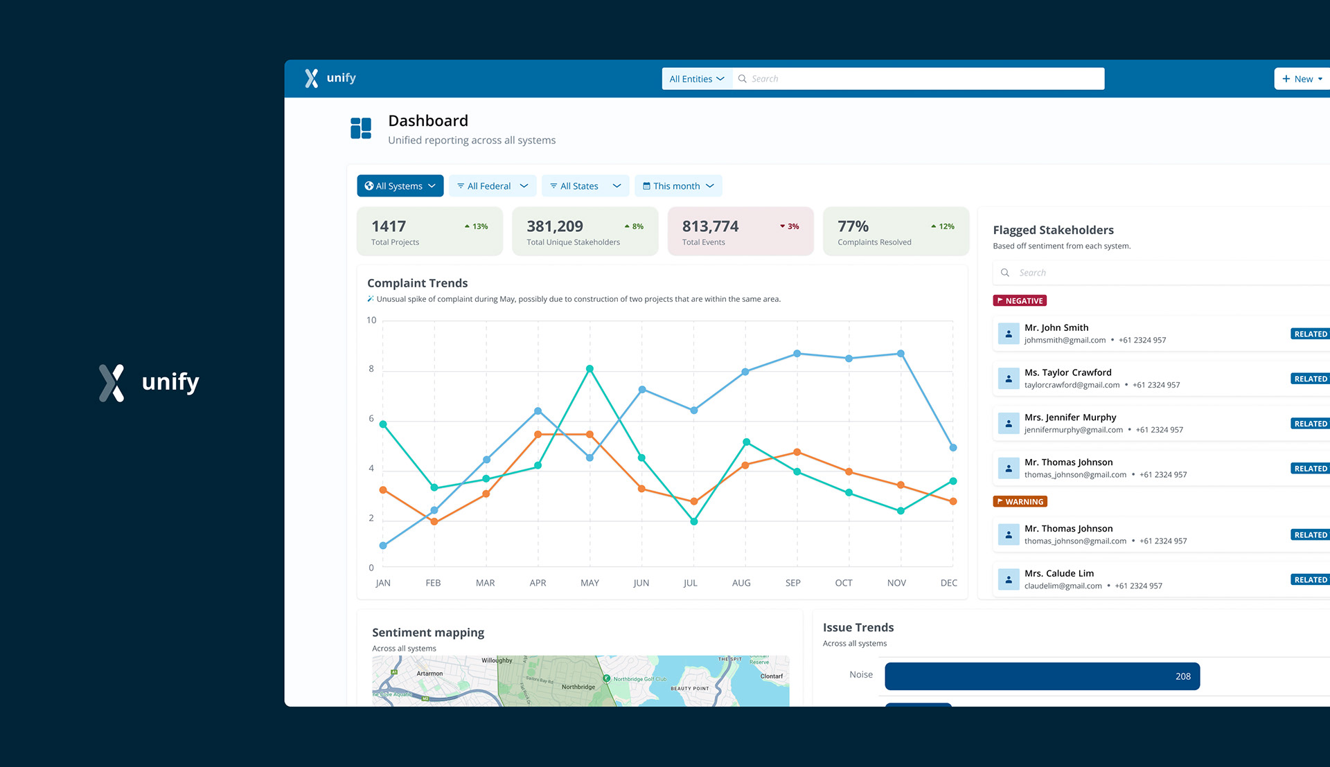
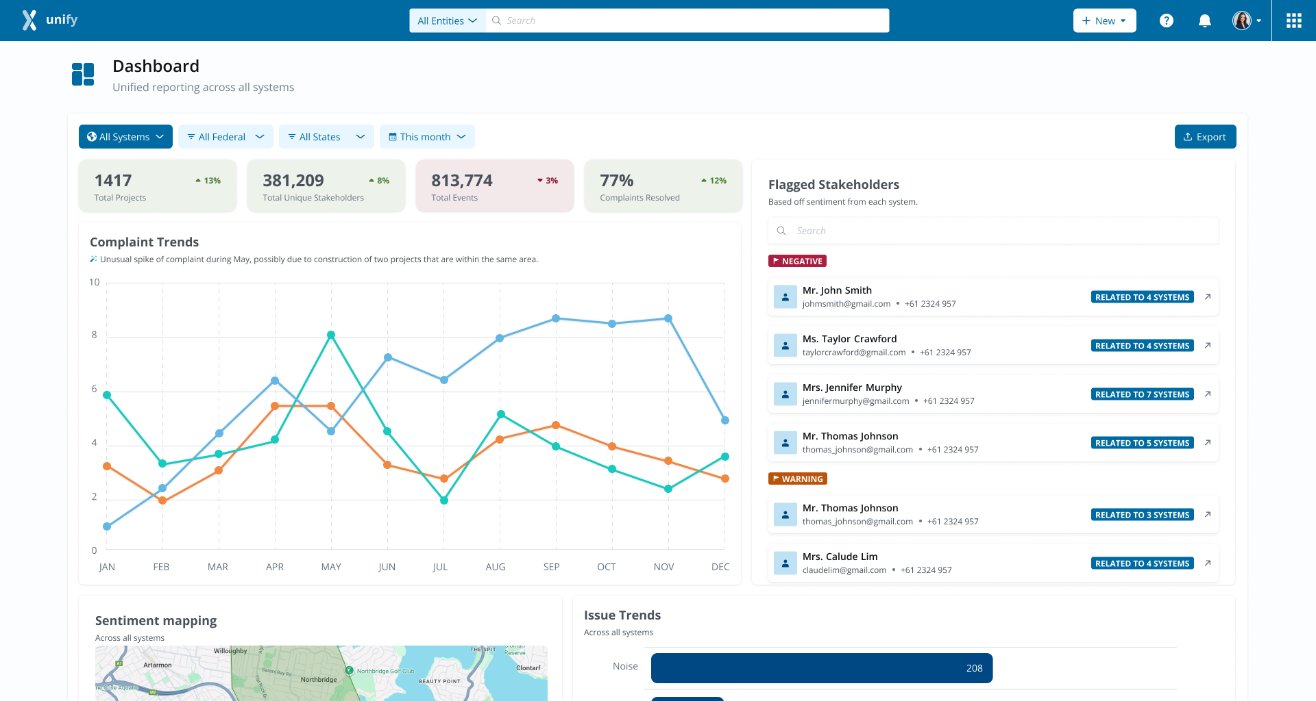
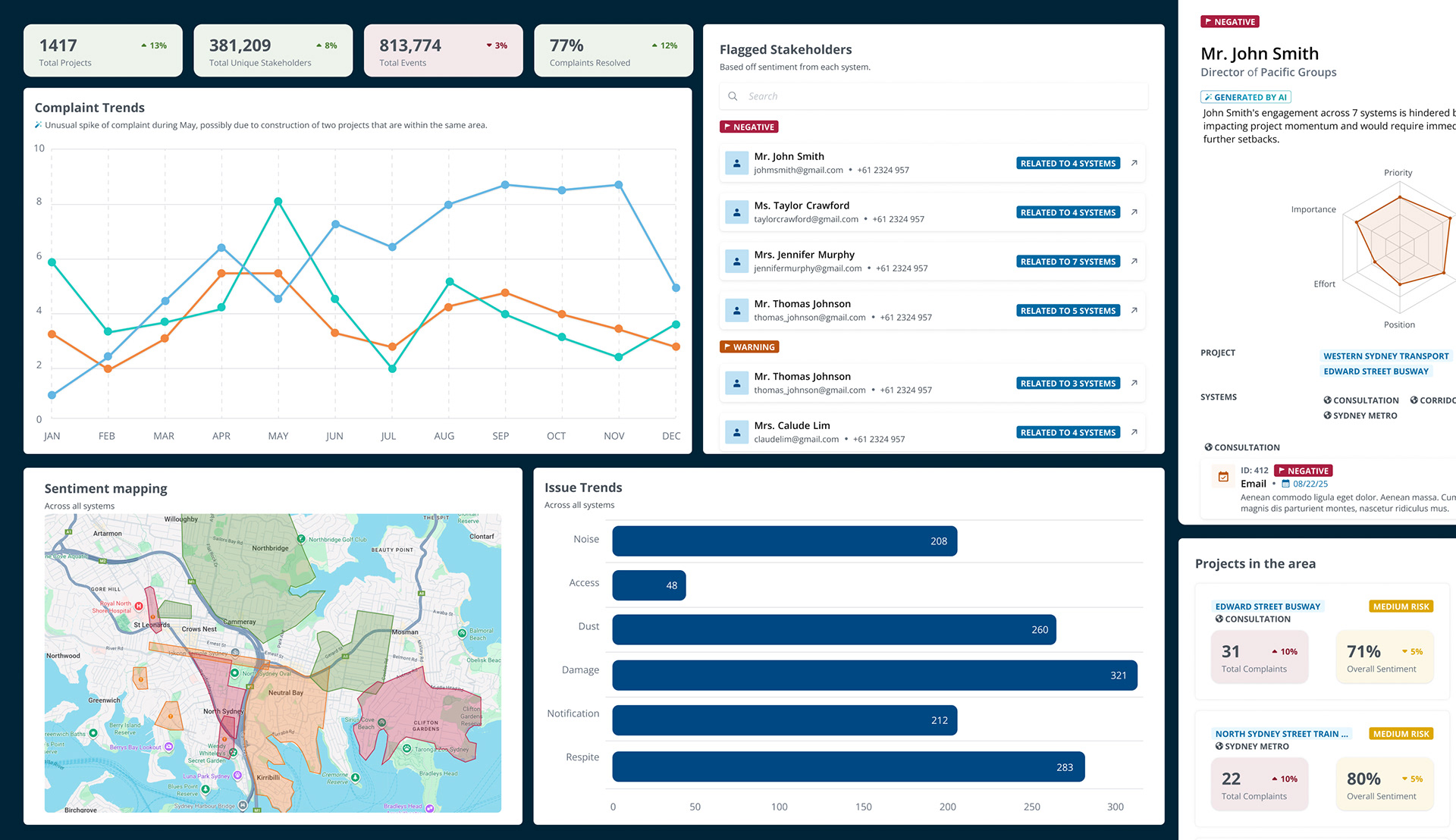
The dashboard consolidated multi-source data into a single, intuitive interface. It included:
- KPI summary cards for high-level sentiment trends
- Time-series charts tracking sentiment over time
- Regional maps visualizing geographic variation
- Comparative views across projects and regions
- Flexible filtering options for time, location, and project scope
- Time-series charts tracking sentiment over time
- Regional maps visualizing geographic variation
- Comparative views across projects and regions
- Flexible filtering options for time, location, and project scope
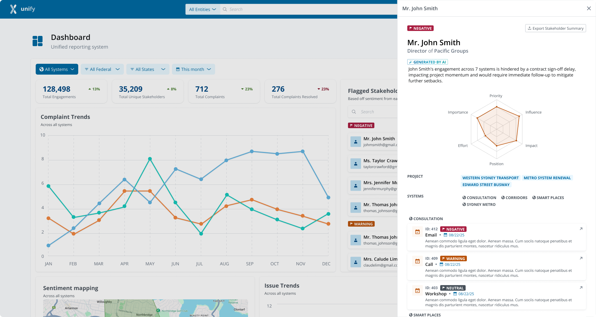
Progressive disclosure ensured each user level — executive, planner, project manager — accessed the appropriate level of detail. Sentiment signals were structured to highlight anomalies, track volatility, and surface emerging risks, reducing cognitive load and enabling faster, confident decision-making. Standardized metrics and a clear visual hierarchy ensured consistency and scalability for future growth.
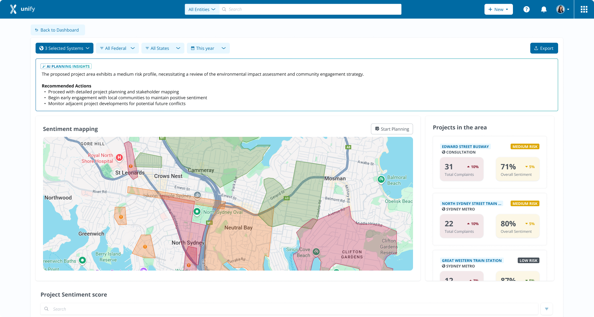
A key component of the dashboard was the sentiment mapping module, which visualized community feedback across multiple projects and regions. It consolidated complaints, survey responses, and social media sentiment into a single, actionable view, allowing users to quickly identify emerging issues in neighboring projects and understand regional sentiment trends. By highlighting positive, neutral, and negative signals geographically, the module enabled planners and executives to compare sentiment impact across projects, monitor shifts over time, and prioritize mitigation strategies. This feature transformed complex, scattered feedback into clear, decision-ready insights, supporting strategic planning and risk management at scale.
Components
Outcome
The solution delivered measurable business impact: the client renewed the $5M contract, and stakeholders praised the clarity, speed, and usability of the dashboard. The platform was transformed from a reporting tool into a strategic decision-support system, demonstrating my ability to deliver enterprise-grade UX under high-stakes, time-sensitive conditions.